UI/UX Design That Quietly Does the Selling for You
July 18, 2026 · admin
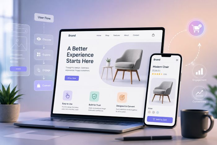
The best interface design is the kind you never notice. You came to do something, you did it, you left — and nowhere along the way did the screen make you stop and think. That invisibility is hard to achieve, and it’s quietly responsible for a lot of the sales a business assumes came from somewhere else.
UX is the plan, UI is the finish
People use the terms interchangeably, but they’re different jobs. UX is the thinking: what task is the person here to complete, what’s the shortest sensible path, where might they get stuck? UI is how that plan looks and feels — the type, the spacing, the colour, the little moments of feedback when you tap something. You need both. A gorgeous interface over a confused plan is lipstick on a maze.
Friction is where you lose people
Every extra field, every unclear label, every “are you sure?” is a small toll you charge your visitor. Charge too many and they leave. Most of the time, better UI/UX design isn’t about adding delight — it’s about removing friction no one defended in the first place.
- Ask for less. Do you really need their phone number to send a quote?
- Label things in plain language, not internal jargon.
- Show clear feedback, so people always know what just happened.
Design for the second visit
First impressions get all the attention, but repeat use is where products are won or lost. The layout that dazzles on day one can grate by day thirty. So we design for the returning user too: predictable patterns, controls that stay where you left them, and shortcuts for the things people do again and again.
Accessibility isn’t a checkbox
Readable contrast, sensible text sizes, keyboard navigation, labels that a screen reader can announce — these aren’t favours to a minority. They make the product better for everyone, in bright sunlight, on a cracked phone, at the end of a long day. Building them in from the start costs far less than retrofitting them after a complaint.
Measure, then trust your eyes
Numbers tell you where people struggle; watching a real person use the thing tells you why. Use both. Analytics will flag the step where visitors drop off, but five minutes over someone’s shoulder will show you the tiny confusion the chart could never explain.
Great UI/UX design is rarely one big idea. It’s a hundred small, considerate decisions that add up to a product people quietly enjoy using. If yours could be smoother, we’d love to take a look.
Leave a Reply