Logo Design, Minus the Myths: What Actually Makes a Mark Work
July 17, 2026 · admin
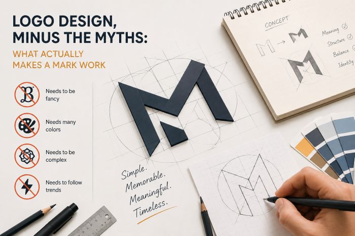
Ask ten people what makes a good logo and you’ll get ten confident, contradictory answers. It should be memorable. It should be timeless. It should “pop.” Most of that advice is folklore. After designing a lot of marks — some that worked, a few that taught us hard lessons — here’s what we actually believe.
A logo isn’t your brand, but it carries it
Your brand is the whole impression: how you sound, how you treat people, whether you deliver. The logo is just the handle everyone grabs it by. That’s why chasing a logo that “means everything” is a trap. It doesn’t need to explain your company. It needs to be recognisable and to feel like you. Meaning accumulates over time, through everything you do; the mark simply collects it.
Simple travels further
The logos you can draw from memory are almost always the simple ones. There’s a practical reason: a mark has to survive a favicon, an app icon, an embroidered shirt, and a billboard, often in a single day. Detail that looks refined at full size turns to mud at 16 pixels.
Simple doesn’t mean boring. It means every element is earning its place. When we’re unsure, we remove something and see if anyone misses it. Usually no one does.
The process we trust
Good logo design is less about a flash of genius and more about disciplined exploration:
- Understand first. Who is this for, what should it feel like, where will it live?
- Sketch widely, cheaply. Lots of rough directions before anything gets polished.
- Test in the wild. On a phone screen, in one colour, shrunk down small.
- Refine the survivors. Only the ideas that hold up get the careful treatment.
Colour, type, and the details that quietly matter
A logo rarely arrives alone. It needs a colour or two that work in print and on screen, a typeface that shares its personality, and clear rules for spacing so it isn’t cramped against other things. These “boring” decisions are what make a brand feel coherent across a website, a business card, and a delivery van. Skip them and even a lovely mark starts to look accidental.
When it’s time to redesign
Redesign when the business has genuinely changed, when the mark can’t keep up with where you’re used now, or when it was never built to work at every size. Don’t redesign because you’re bored of it — you see it a thousand times more often than your customers do, and their recognition is an asset you shouldn’t throw away lightly.
If you’re weighing up a new identity, we’re happy to give you a straight opinion. Start a conversation and we’ll tell you honestly whether it’s worth it.
Leave a Reply